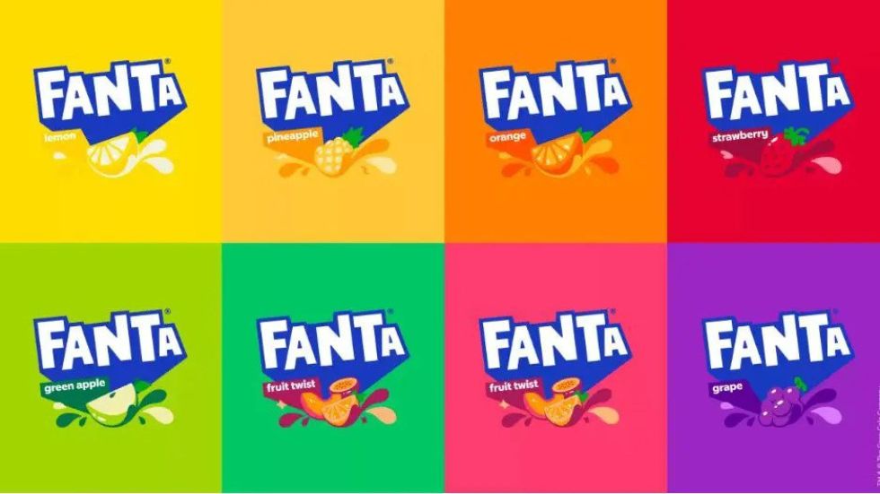
Fanta has unveiled a new global brand identity for the first time, with a new logo to roll out across all of its markets.
Up until recently, Fanta has had an entirely different logo and packaging design in the US compared to its international markets. Fanta is The Coca-Cola Company’s second oldest brand, founded in 1940.
Coca-Cola announced that the Fanta logo was redesigned to make it more simple and modern. The new logo redesign will be used across all of Fanta’s range of flavours, and as such the design team removed the orange and leaf from the logo.
The new logo will be used in all countries, replacing previously separate brand identities in different regions. Fanta’s rebrand comes just after Coca-Cola scrapped the Lilt brand in the UK, rebranding the drink as Fanta Pineapple & Grapefruit.
This is comfortingly reassuring. Over the past decade there has been much change in the brand marketing world. Small, authentic brands have delivered strong growth and in some cases, fundamentally disrupted categories and consumer thinking through their use of founder stories, provenance, local sourcing, sustainability, new flavours and ingredients (such as plant-based) and creative communications. Scale has been questioned as a driver of competitive advantage and there has been a discussion on whether ‘big’ brands and brand marketing is experiencing an existential crisis. All of this may contain a germ of truth, but… sometimes big brands need to do what only they can and this is an example of what scale can deliver. A powerful dynamic brand identity, simple, universal, it will create strong brand-blocking in-store and stand-out in other channels. It is modern, vibrant and, ultimately, as said, comfortingly reassuring.
See more: https://www.fanta.com/

