Fairy Liquid has undergone the biggest revolution in its 62-year history with the iconic bottle turned ‘upside down’ for the first time. The new container sees the liquid dispensed from the bottom, meaning the days of carefully balancing the bottle on its narrow red lid to get the last dregs out are behind us.
To mark the occasion, Fairy has unveiled a gallery of images showing how the design has evolved since the first bottle in 1960.
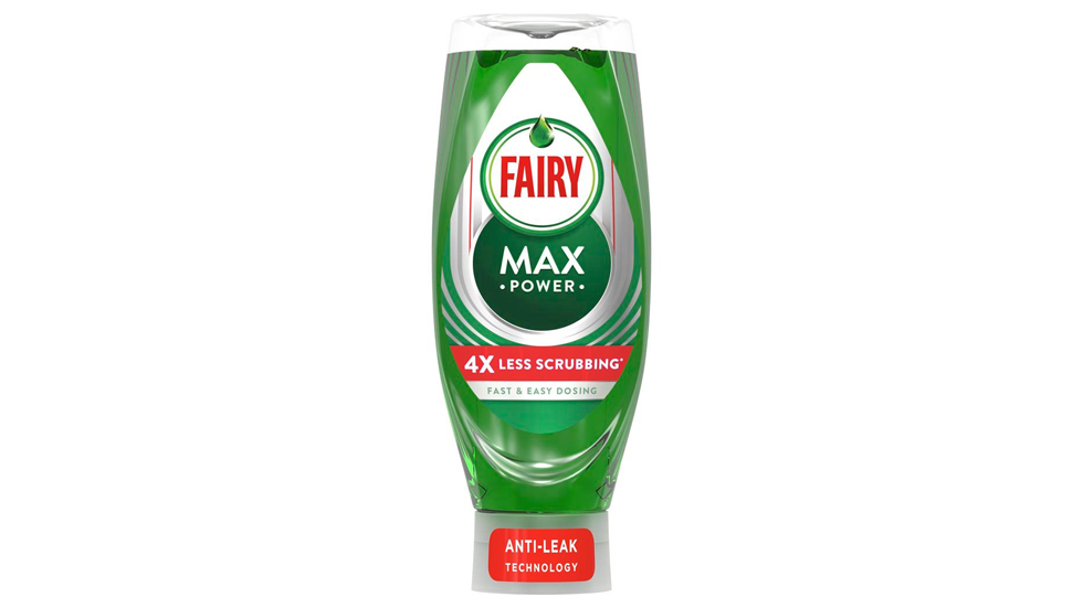
As there was a shift towards more consumer and eco-friendly packaging, the classic white bottle was replaced with today’s transparent container in the early 2000s. The new, efficiently redesigned, bottle means it’s much easier to get the last drop of washing up liquid out, while its anti-leak technology means messy caps are a thing of the past – providing improved innovative packing and a new improved formula.
Iconic brands are truly powerful things that need constant love and attention to keep them relevant and distinctive. P&G are rightly regarded as one of the world’s best brand custodians. This is a simple solution based on meeting a consumer need for added convenience, but the evolution of the Fairy pack over 60+ years has needed genuine strategic thought. The balance between protecting distinctive icons – Coke’s bottle shape, the Johnnie Walker ‘striding man’, the Nike ‘swoosh’ – whilst evolving them to maximise relevance is complex. Linking the new pack to an innovation (Max Power) with strong claims (4x less scrubbing and fast/easy dosing) is important in maintaining relevance and managing change. The key is that the new pack is still clearly from the Fairy Liquid consumers know and trust.
#WhatBrandsDo